How Bloomsberry Designed their Chocolates
26 Apr 2016
A couple of weeks before my friend gave me two tasty chocolate from New Zealand by Bloomsberry & Co chocolate company. But more than the chocolate I really liked the packaging. It's a good piece of work, felt it very innovative. So, I thought of sharing my observations and reason why I liked it
Let's start with the company, and it's interesting because they are not like any other chocolate company that I had ever seen.
Bloomsberry & Co
“There we were, a happy designer company minding our own business in beautiful New Zealand. Then you found us and ripped our wrapping right from under our noses and suddenly they were in your hands, all over the world.”
After reading this description, I got stunned for a second, because I can't believe that this is a designer company rather than a chocolate company, but their chocolate tastes excellence! I think this cultural difference made them think out of the box and design chocolates with importance to sight and emotion along with great taste.
Generally, when we talk about chocolates, they are meant to satisfy our taste buds and this is same with Bloomsberry. But more than the chocolate, the company believes in the philosophy of gifting and made their chocolate as a perfect gift.
Chocolate as a Gift
Gifting something sweet has been there in everyone's culture even centuries back and still continuing. Whenever we think of gifting someone, we will definitely think through the possibility of gifting chocolate and sometimes you may end up buying it. But still the dilemma continues regarding which chocolate should I select? This the question were Bloomsberry try to answer and the answer is just below.

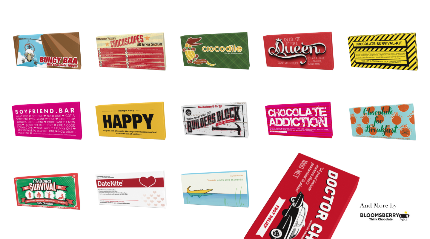
For gifting on different occasions and life scenarios, Bloomsberry created a wide range of chocolate with beautifully composed good and big illustrations on the front, which make them outstanding from any other chocolates.

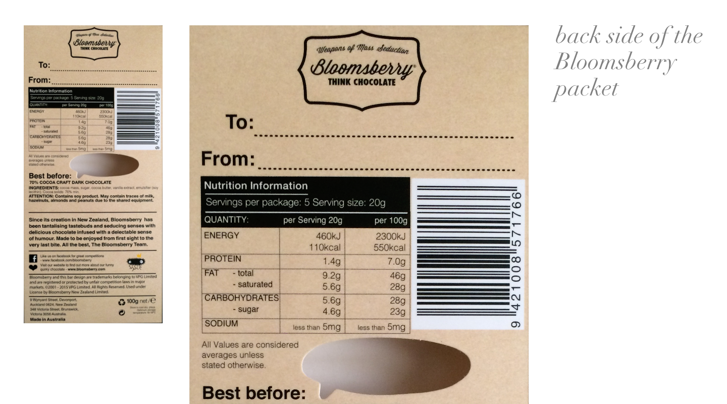
Did you noticed the To & From on the back side of the chocolate packet, where you can write your name and the recipient name. This interaction emphasis gifting, when we pack a gift we always write "to & from", and bloomsberry reflected it in their packaging very well.
Chocolate as an Art
Ever bloomsberry packet that you take will be a visual treat and it will be very hard to select the best design from the herd.
When you compare the front cover of chocolates with bloomsberry, they stand unique from others. Because the used the entire front cover to design the content. The don't even add their name in the front. Instead, they put it on the sides of the packet and used the entire canvas to create beautiful illustrations.
Chocolate as a Goodie
Bloomsberry also allows you to customize the design of the packets by providing a service for groups to print their desired design into the full-sized canvas. Bloomsberry will also help you in designing if you don't have a designer on board.
This is a good service more focused to corporates and startups so that they can create their on chocolate goodie with an attractive full-size design reflecting their product on the cover rather that sticking into the traditional way of t-shirts and mugs. You can use this custom designed bar at conferences, on employee onboard, gifting your top customers, etc and this will definitely create some noise in your social media handles like Twitter or Instagram (like posting a selfie with the bar). I think this a good business collateral, but the only concern is the cost. But apart from that it's a good idea to allow custom designs and opening new opportunities through chocolates
Chocolate as a Conversation Kicker
Whenever they create an illustration, they will never forget to add the emotions into it, Mostly they add fun. So, when you gift this to a person and when he see it he will definitely smile and he will start talking about his reason behind the smile and the conversation goes on. This reminds me of three basic steps and the juicer, Mentioned in the book Emotional Design by Don Norman.
“Khaslavsky and Shedroff suggest that the three basic steps are enticement, relationship, and fulfillment: make an emotional promise, continually fulfill the promise, and end the experience in a memorable way.”
And in the case of bloomsberry chocolate, I felt they followed these three steps.

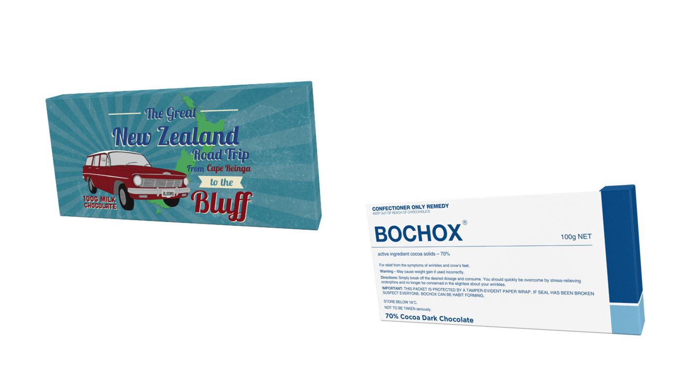
These are the chocolates that I got. First once from left is the great New Zealand road trip and the second one is called Bochox.
Which packet I like the most and Why?
I really liked both of the packets. For best illustration I will raise the hand for the great New Zealand Road trip. Because I really liked the composition bring a retro style by adding pastel colors and rising sun pattern, Typography, Layout and graphic elements, it completely reflects a road trip. I think this packet is good to gift if any of your friends who's going for the great New Zealand trip.
For best fun, it's Bochox. I really like the way they put fun to packet. If I give this to a friend who is in hospital, he will definitely laugh. Also my mom got confused this packet with a medicine packet and asked me what medicine is this?
Conclusion
I really got inspired their way of thinking given to the product and the way in which they mixed culture and emotional values to the product.
To whom I showed this packet include my mom, we talked about the packets for a couple of minutes. We discussed the beauty and how skill behind it. It's very hard for a product to earn such an appreciation and Bloomsberry Earned.
Try to get a couple of Bloomsberry bar its worth trying it out.
So, Happy Chocolating and Peace!
